October 18, 2010

Memphis to Boston


This was for the Boston Globe Magazine about a woman, who when a girl moves from Memphis to Boston for a scholarship. She ends up staying for career and marriage, but never quite feels at home in the North.

She ponders this, from the article -

"Now, though, I wonder. The prompt is Isabel Wilkerson’s magnificent new
book, “The Warmth Of Other Suns,” a dense and moving exploration of the
Great Migration. Wilkerson chronicles both the highs and lows of that
fifty-year, nation-altering event but mainly suggests it was ultimately for
the good. Was it?"


For some reason I really responded to this piece. Perhaps because Jacob Lawrence, the great artist of the great migration, was one of my favorite artists as a high schooler. Or perhaps because I have never really felt at home no matter where I live.

One thing I do know is, I wish I didn't have to do so many color studies to be happy!

Update March 2011: This piece just won a Silver at the Society of News Design.
Thanks for submitting it Grant!

October 13, 2010

Curse/Bless Photoshop


On friday I did a quick piece for the NY Times Week in Review, on the tricky relationship between the U.S., Pakistan, Afghanistan and the Taliban. At the last minute it needed a quick color change because of a color clash with something else on the cover. It happens and it's totally unforeseen and because of Photoshop this is so easy and routine I don't even think about it anymore, in a few minutes it was done. Bless Photoshop.


It reminded me I forgot to post this piece I did for Columbia a little bit ago.
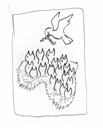
The article was on over-population, mainly in Africa.

This was the rough they liked. Only direction was "make sure the nest looks like Africa"
Which I did and the editors were happy. Sent off, done and invoiced.

A week later, just hours before they go to press, the slightly stressed AD calls and says the editors just decided they want the nest NOT to look like Africa, they want it general.

I was pretty worried at first I would have to repaint the whole thing, since my work is mainly non-digital. (Of course they offered to pay for the repaint)

But in about 30min I had it done, all thanks to Photoshop.

Bless Photoshop.


Or was it because of Photoshop?
Since everyone is so used to being able to make such last minute changes, perhaps this allowance for more indecisiveness is sometimes a curse.

Curse Photoshop.

September 27, 2010

Recent Work and Coincidence

Got busy and behind on my postings.
Here's some recent work and a coincidence....


Best Primary Schools in Denver, for 5280 Magazine.

Design and art direction by Dave McKenna.

For ESPN on NBA owners, Siung Tjia AD.

For Los Angeles Magazine, a beautiful mag I drooled over in Pasadena for ICON, so I was thrilled to get a call from them after I got back. Carol Wakano AD.


Fun subject for Washington Post Magazine on mini-skirts lengths. Lori Kelley AD.


For the Progressive on our oil economy and the gulf. Nick Jehlen AD.


At lastly I ran across this ad a few days ago, and thought it had an uncanny resemblance in composition and concept to an illustration of mine that was in the CA annual a few years ago. Probably just coincidence.

August 18, 2010

Runner's World


Important lesson: If you use your spouse as a reference model, do not make her LOOK fat.
Especially for a magazine she and all her friends subscribe to.

The magazine was Runner's world which is an honor to work for because it's always chuck full with great illustration.

Subject was mental grief over injuries and how to recover faster. Marc Kauffman was the AD.

Rough ideas. Marc picked my favorite, but I knew the comp needed major consolidation.


Color studies, and now I start to get into trouble....

My wife posed for this, and she thinks I made her look fat. I totally disagree. She was convinced the magazine would make me repaint the figure thinner. Surprise honey, they didn't.

But I still can't convince her, and she may never pose for reference again. Perhaps you all could help.

Here's the main piece in print.
Lucky for me the other one is small on the turnpage.

July 26, 2010

ESPN the Magazine

Got to illustrate the "Messiest Divorce in Sports", yeah even messier than Tiger's...
That of the owners of the LA Dodgers for ESPN the Magazine. Art director was Ed Mann.

A few days after I finished the piece, I got to see Dodger Stadium for the first time when I was in LA for ICON6.

Had fun with the roughs, I even gave them a typographic option. Why? I just couldn't help myself and got obsessed seeing if it would work. Fortunately Ed picked the more compact solution.

Whenever I'm lucky enough to do a spread for great designers, I'm so excited to see what they come up with after I turn in the artwork. I love being surprised and at ESPN they always deliver.

July 19, 2010

George Steinbrenner killed my NY Observer cover

Well actually not him exactly... his death did.
Last week right when I was almost done with this conceptual portrait of notorious developer Shaya Boymelgreen, for the cover of the New York Observer, news came in of the Yankees owner's passing. Which was much bigger news. Actually, I've been in this business long enough to be totally used to things that happening.

Here's my tight color sketch in the mockup. And the cover that had to replace it.
Kudos to Kathryn Rathke for cranking out that portrait of George in probably less than an hour!


Here's my final art that did run inside for the same budget, thanks Nancy!
We didn't want to make fun of his features so the caricature aspect is toned down and Nancy wanted the buildings in his beard to be subtle, which was really nice to do that way.

July 13, 2010

July Progressive Cover

Got to tackle the complicated issue of the Arizona immigration law for Nick Jehlen at the Progressive.

Some sketches...


Some reference....


Apologies to Georgia O'Keefe, I know you worked in New Mexico.


And this is why Nick Jehlen, is my favorite art director in the whole world!
Because he let me do this spoof of those kitschy southwest lizards, for the inside.