October 31, 2012
Art is Dead
For an article in the Wall St. Journal, originally titled "Art is Dead".
A great read!
The title was later changed to How Capitalism Can Save Art, but I liked the original title. It was more inspirational for me in the concepting phase. I was leaning toward the dead fish, but Keith picked a better one in the end.
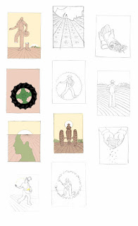
One of a few of the composition and color studies.
September 14, 2012
TIME: Cheap Oil vs. Green Energy
For TIME on how a new age of cheap oil could undo the nascent green energy revolution.
Some roughs, I've always loved making faces with outlets, but Nai thought the battered windmill was better.
And the piece in print.
September 5, 2012
The Dawn of BBQ
A Wall St. Journal article was about how meat-eating and evolution were tied together. Basically the prehistoric roots of BBQ.
The editors specifically requested a caveman grilling, so I explored that. But of course I tried hard to come up with some better ideas. Really enjoyed spoofing 2001 Space Odyssey and a Banksy piece.
But Keith being the smart art director he is picked the cave painting idea, which was very fun for me to try to imitate that style.
Trying to imitate the surface of this reference I used my usual printmaking technique but I hammered, scratched and used charcoal and chalk over it.
But still didn't come close to the beauty of the real thing.
Perhaps I just need a 30,000 year old patina....
The editors specifically requested a caveman grilling, so I explored that. But of course I tried hard to come up with some better ideas. Really enjoyed spoofing 2001 Space Odyssey and a Banksy piece.
But Keith being the smart art director he is picked the cave painting idea, which was very fun for me to try to imitate that style.
But still didn't come close to the beauty of the real thing.
Perhaps I just need a 30,000 year old patina....
August 15, 2012
Runner's World
It's always fun to get a job from Runner's World because they use a lot of quality illustration.
And I enjoy the challenge of trying to do something new with a runner or running shoes, because I have a feeling they've seen it all, or close to it....
The subject was getting back into a running routine after an injury or time away.
Here's the smaller one that went on the turnpage.
But there was a hang up with the final, and this is why it's helpful to have a second set of eyes on a job. It was pointed out my foreshortened leg could be confused with something else.

The "fixed" version in print.
August 8, 2012
The Gentler Face of Tyranny
For Bloomberg Businessweek. An book review of "The Dictator's Learning Curve".
The headline was "The Gentler Face of Tyranny" that was written after they saw my final, which was a nice touch.
I had to make sure there were plenty of ideas without fists, just in case they used the book being reviewed as a design element, since it had a fist on it's cover...
.... which they did. Thanks to Chandra for the good art direction!
July 31, 2012
Seattle 2012
For Seattle Met magazine on Seattle's failed attempt to get the 2012 Olympics. I was excited to get this assignment from Chris Skiles, such a visually rich subject matter....
Had alot of fun with these roughs, and learned about the Seattle Troll in the process. I've flown into Seattle plenty of times, but only really been there once. I even tried to come up with some lil seattle mascots, which was alot of work for a rough, but I couldn't stop myself, because I love that Northwest Indian art.
My favorite was actually the Pike's Market fish javelin thrower, but I was happy to do the pole vaulter, which is a more classic graphic image, thanks Chris!
July 24, 2012
Progressive Cover
Progressive Cover for August. Article was by Wendell Berry on how most people have lost their connection to the land.
I did a few that spoke directly to that, but some others that hinted at the fertility cycle.
Here's the piece on the cover.
And Nick chose this horn of plenty glove for the bw inside piece.
Makes me want to garden more.
Subscribe to:
Posts (Atom)


