August 18, 2010

Runner's World


Important lesson: If you use your spouse as a reference model, do not make her LOOK fat.
Especially for a magazine she and all her friends subscribe to.

The magazine was Runner's world which is an honor to work for because it's always chuck full with great illustration.

Subject was mental grief over injuries and how to recover faster. Marc Kauffman was the AD.

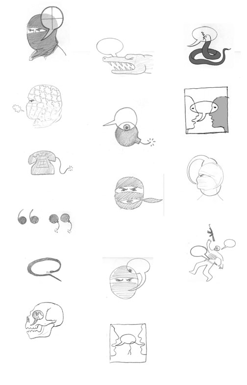
Rough ideas. Marc picked my favorite, but I knew the comp needed major consolidation.


Color studies, and now I start to get into trouble....

My wife posed for this, and she thinks I made her look fat. I totally disagree. She was convinced the magazine would make me repaint the figure thinner. Surprise honey, they didn't.

But I still can't convince her, and she may never pose for reference again. Perhaps you all could help.

Here's the main piece in print.
Lucky for me the other one is small on the turnpage.

July 26, 2010

ESPN the Magazine

Got to illustrate the "Messiest Divorce in Sports", yeah even messier than Tiger's...
That of the owners of the LA Dodgers for ESPN the Magazine. Art director was Ed Mann.

A few days after I finished the piece, I got to see Dodger Stadium for the first time when I was in LA for ICON6.

Had fun with the roughs, I even gave them a typographic option. Why? I just couldn't help myself and got obsessed seeing if it would work. Fortunately Ed picked the more compact solution.

Whenever I'm lucky enough to do a spread for great designers, I'm so excited to see what they come up with after I turn in the artwork. I love being surprised and at ESPN they always deliver.

July 19, 2010

George Steinbrenner killed my NY Observer cover

Well actually not him exactly... his death did.
Last week right when I was almost done with this conceptual portrait of notorious developer Shaya Boymelgreen, for the cover of the New York Observer, news came in of the Yankees owner's passing. Which was much bigger news. Actually, I've been in this business long enough to be totally used to things that happening.

Here's my tight color sketch in the mockup. And the cover that had to replace it.
Kudos to Kathryn Rathke for cranking out that portrait of George in probably less than an hour!


Here's my final art that did run inside for the same budget, thanks Nancy!
We didn't want to make fun of his features so the caricature aspect is toned down and Nancy wanted the buildings in his beard to be subtle, which was really nice to do that way.

July 13, 2010

July Progressive Cover

Got to tackle the complicated issue of the Arizona immigration law for Nick Jehlen at the Progressive.

Some sketches...


Some reference....


Apologies to Georgia O'Keefe, I know you worked in New Mexico.


And this is why Nick Jehlen, is my favorite art director in the whole world!
Because he let me do this spoof of those kitschy southwest lizards, for the inside.

June 30, 2010

NY Times OpEd today

For today's OpEd in the NY Times on talking to terrorists.
Writer argues that, engagement over time can change terrorist groups to be more mainstream like Nelson Mandela's ANC, which was once listed by the US as a terrorist organization.
Maybe... but the article's mentioned group's goals seem a bit more specific, achievable and platable than say Al-Qaeda's. But the writer does acknowledge this.

I finally got approved on this job late in the day and was worried, but Sen. Byrd's passing bumped it back and gave me a extra day for the finish.
Aviva on the other hand never sounds worried, how she does that with all those tight deadlines is beyond me.

First set of roughs, when I thought the article was mainly focused on talking to terrorists in order to understand them better in order to kill them.

Second set of roughs after I got the focus right.

May 28, 2010

Energy Biz Cover

Got to do a fun job on one of my favorite subjects: green power.
I know it's a power hungry world and green power still seems like a fantasy, but here's to hope!


Art directed by Jürgen Mantzke who is also an illustrator. He had the interesting direction of trying to show the future by hinting at the past, which was fun to explore.

Here's a smaller piece I did for inside.

Some color studies, they preferred the dark blue, better for the loads of typography.

Ironically immediately after I finished this job we went on a kayak/raft trip down the San Juan river (4 corners area) and found this petroglyph. There is something cool about sticking your nose right up to 4,000 year old artwork and no alarm going off.

I considered putting this one in the SI:EARTH Fragile Planet show, but went with my original entry.

I'm actually going to fly out for the show, hope to see you there! You won't miss me... in order to neutralize the carbon impact from the jet fuel I'll burn, I'm going to wear a loincloth I weave en route out of opaque plastic shopping bags.

And after the show I'll recycle the loincloth it by giving it to my petroglyph friend above.

May 22, 2010

ai5000 "Mr. Responsible"


Forgot to post this last month, finally got to work for the venerable SooJin Buzzelli!
It was a portrait of James Gifford for Asset International.

Basically this guy goes all around the world partly with the UN, showing that socially and environmentally sound investment practices pay better in the long term.

I've been doing more portraits lately, although it's not my specialty, I've draw thousands of portraits as caricature artist when I was a teenager, so that helps me not be so rusty at it.

On the page.