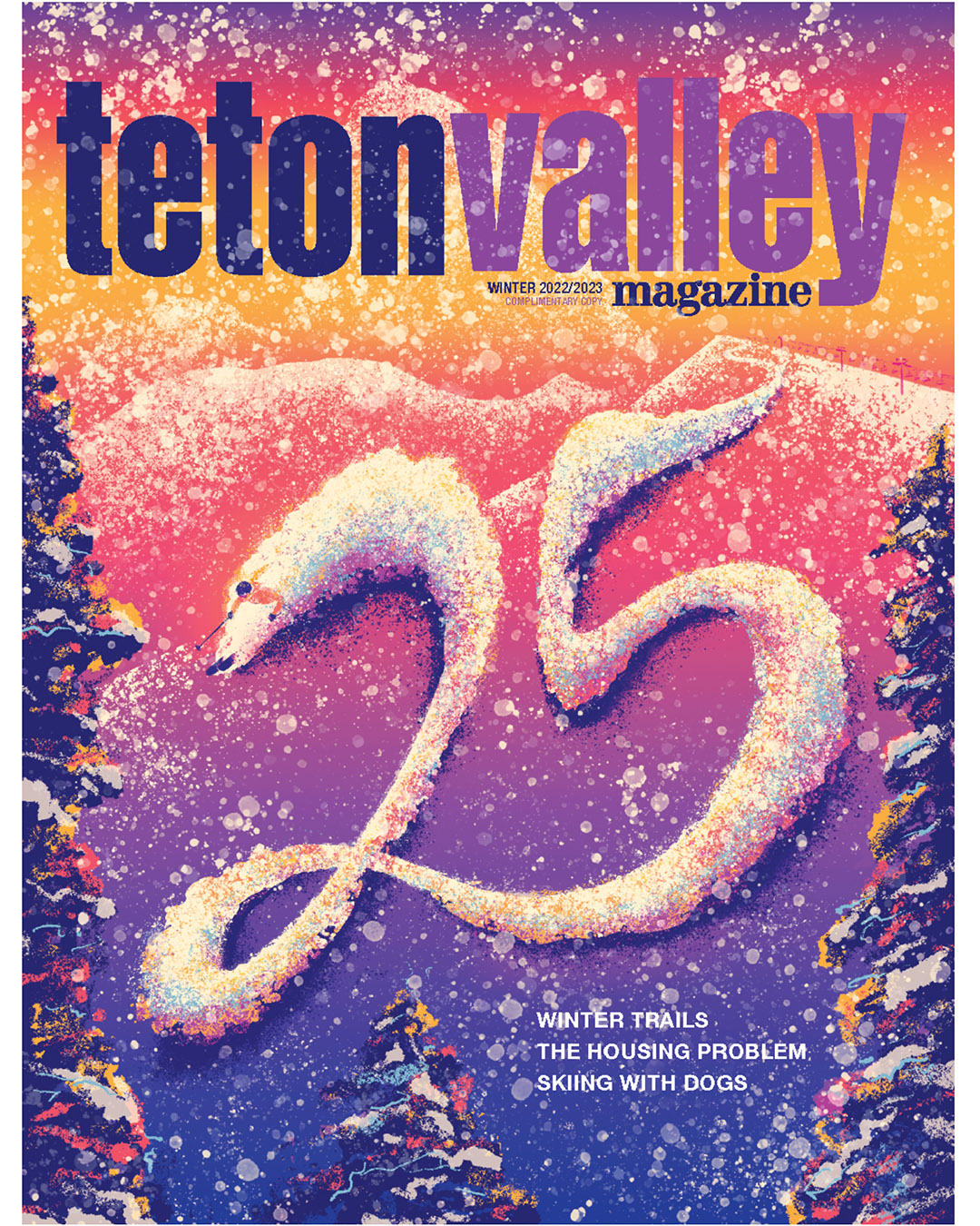
Final Cover

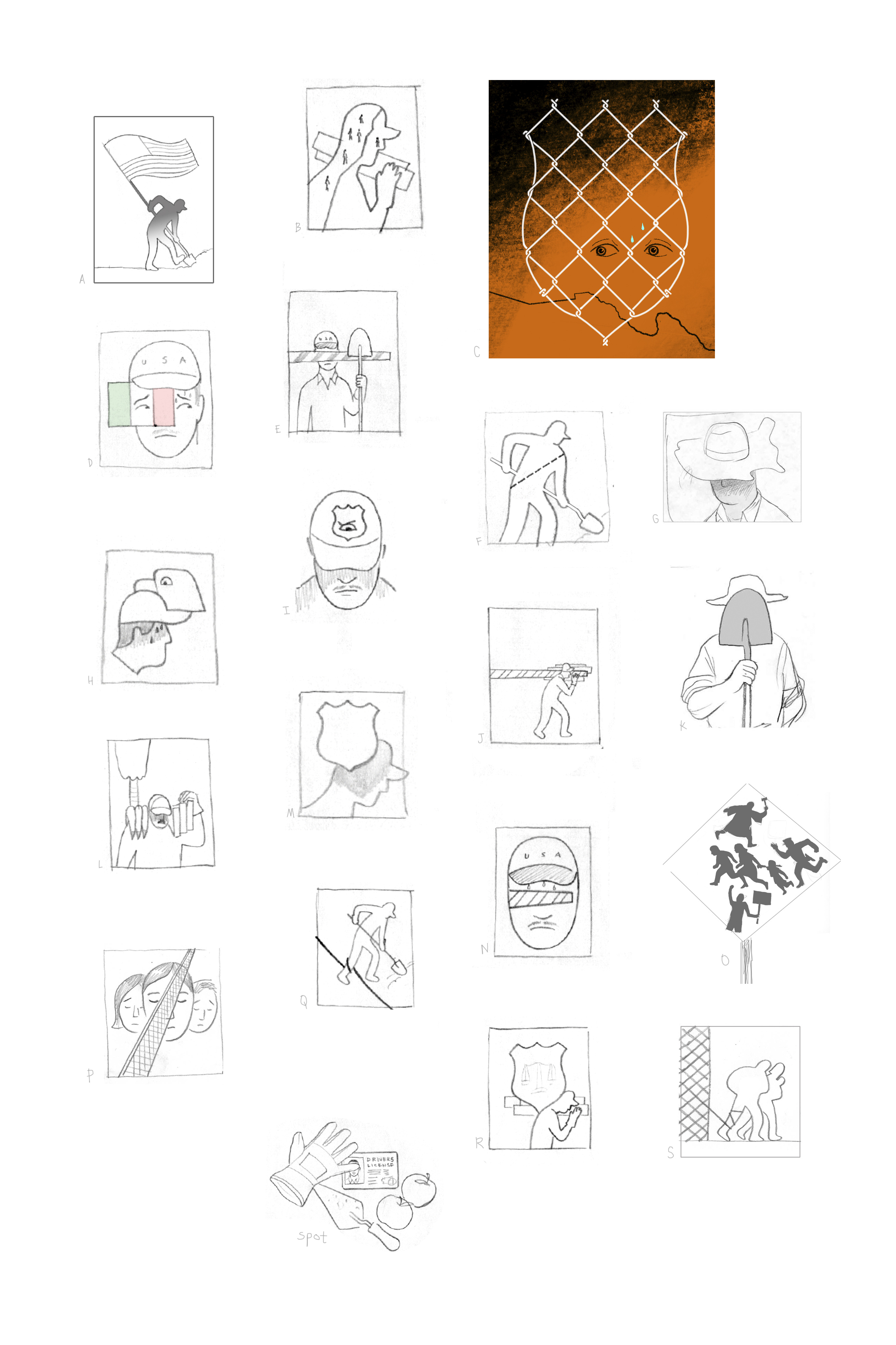
Roughs I sent to Lori the AD on this.

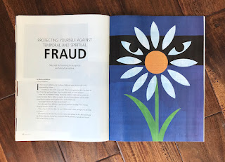
Cover for Monmouth University magazine


"Spiritual and Financial Fraud"
for the Ensign magazine

Some roughs, dropped a few into the layout the AD on this (Hailey Wagner)
had supplied to me at the start.

Here's some the accompanying spots.
Thanks Hailey!

So coronavirus kept me busy illustration wise in 2020. Mainly this series for Deloitte.
The above Black Swan cover was probably my favorite from the series.