
Here's a experimental piece I just did.
I've had the idea for awhile and hoped to use it for an article but the right fit never came up, so I decided just to paint it.
 Here's some of the studies.

 The article was specifically focused on the aftermath of the BP oil spill and the government, so I covered that in my roughs that I submitted, by I always like to include ideas that have a universal appeal to them, and Nick often seems to pick those.
 Of course it would need a much better composition.
 Getting the white clouds to work together and read separately at the same time took a couple of failed attempts. Getting closer here.
 2 pieces of mine are in the American Illustration 29 book, just out last week.
 If you didn't get one at the party go here to order:
 And along the tech theme, was this piece for the Washington Post Book Review of the new book "What Technology Wants" also by a WIRED editor comparing the evolution of technology to biological evolution.
 Some of the roughs I sent. There were more, but these were my favorites.
 And the layout, just sent to me by the wonderful Carrie Lyle, who smartly art directed this piece.

 She ponders this, from the article -
 One thing I do know is, I wish I didn't have to do so many color studies to be happy!
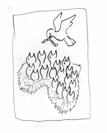 This was the rough they liked. Only direction was "make sure the nest looks like Africa"

 Design and art direction by Dave McKenna.
 For ESPN on NBA owners, Siung Tjia AD.
 For Los Angeles Magazine, a beautiful mag I drooled over in Pasadena for ICON, so I was thrilled to get a call from them after I got back. Carol Wakano AD.
 Fun subject for Washington Post Magazine on mini-skirts lengths. Lori Kelley AD.
 For the Progressive on our oil economy and the gulf. Nick Jehlen AD.
 At lastly I ran across this ad a few days ago, and thought it had an uncanny resemblance in composition and concept to an illustration of mine that was in the CA annual a few years ago. Probably just coincidence.