
Here's a experimental piece I just did.
I've had the idea for awhile and hoped to use it for an article but the right fit never came up, so I decided just to paint it.
 Here's some of the studies.

 The article was specifically focused on the aftermath of the BP oil spill and the government, so I covered that in my roughs that I submitted, by I always like to include ideas that have a universal appeal to them, and Nick often seems to pick those.
 Of course it would need a much better composition.
 Getting the white clouds to work together and read separately at the same time took a couple of failed attempts. Getting closer here.
 2 pieces of mine are in the American Illustration 29 book, just out last week.
 If you didn't get one at the party go here to order:
 And along the tech theme, was this piece for the Washington Post Book Review of the new book "What Technology Wants" also by a WIRED editor comparing the evolution of technology to biological evolution.
 Some of the roughs I sent. There were more, but these were my favorites.
 And the layout, just sent to me by the wonderful Carrie Lyle, who smartly art directed this piece.

 She ponders this, from the article -
 One thing I do know is, I wish I didn't have to do so many color studies to be happy!
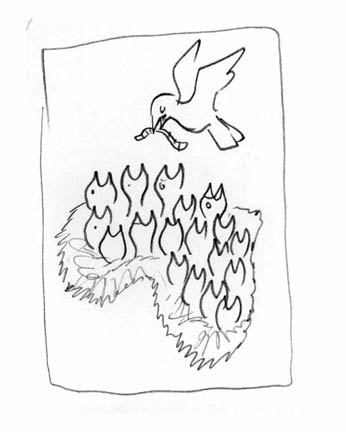 This was the rough they liked. Only direction was "make sure the nest looks like Africa"

 Design and art direction by Dave McKenna.
 For ESPN on NBA owners, Siung Tjia AD.
 For Los Angeles Magazine, a beautiful mag I drooled over in Pasadena for ICON, so I was thrilled to get a call from them after I got back. Carol Wakano AD.
 Fun subject for Washington Post Magazine on mini-skirts lengths. Lori Kelley AD.
 For the Progressive on our oil economy and the gulf. Nick Jehlen AD.
 At lastly I ran across this ad a few days ago, and thought it had an uncanny resemblance in composition and concept to an illustration of mine that was in the CA annual a few years ago. Probably just coincidence.

 Rough ideas. Marc picked my favorite, but I knew the comp needed major consolidation.
 Color studies, and now I start to get into trouble....
 My wife posed for this, and she thinks I made her look fat. I totally disagree. She was convinced the magazine would make me repaint the figure thinner. Surprise honey, they didn't.
 Here's the main piece in print.
 Got to illustrate the "Messiest Divorce in Sports", yeah even messier than Tiger's...
 Had fun with the roughs, I even gave them a typographic option. Why? I just couldn't help myself and got obsessed seeing if it would work. Fortunately Ed picked the more compact solution.
 Whenever I'm lucky enough to do a spread for great designers, I'm so excited to see what they come up with after I turn in the artwork. I love being surprised and at ESPN they always deliver.
 Here's my tight color sketch in the mockup. And the cover that had to replace it.
 Here's my final art that did run inside for the same budget, thanks Nancy!
 Got to tackle the complicated issue of the Arizona immigration law for Nick Jehlen at the Progressive.
 Some sketches...
 Some reference....
 Apologies to Georgia O'Keefe, I know you worked in New Mexico.
 And this is why Nick Jehlen, is my favorite art director in the whole world!
 For today's OpEd in the NY Times on talking to terrorists.
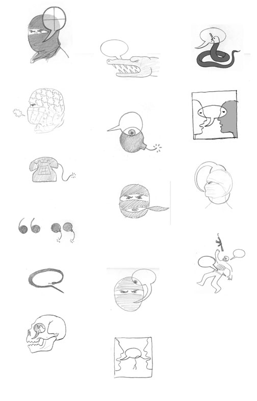 First set of roughs, when I thought the article was mainly focused on talking to terrorists in order to understand them better in order to kill them.
 Second set of roughs after I got the focus right.
 Got to do a fun job on one of my favorite subjects: green power.
 Art directed by Jürgen Mantzke who is also an illustrator. He had the interesting direction of trying to show the future by hinting at the past, which was fun to explore.
 Here's a smaller piece I did for inside.
 Some color studies, they preferred the dark blue, better for the loads of typography.
 Ironically immediately after I finished this job we went on a kayak/raft trip down the San Juan river (4 corners area) and found this petroglyph. There is something cool about sticking your nose right up to 4,000 year old artwork and no alarm going off.
 I considered putting this one in the SI:EARTH Fragile Planet show, but went with my original entry.